Friday, December 3, 2010

Beautiful Color Combos

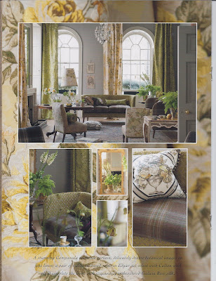
Are you ready for some exciting photographs? These color combinations may be "over the top" for some, but as for me, I LOVE it all! Pay attention to how many styles, patterns and colors are mixed together in one room. Well done, well done. (sorry about the quality, I had to scan the ads!)


My all time favorite color combination...Peacock and Purple:


Photographs are Osborne & Little and Designers Guild

Thursday, December 2, 2010

Open House

Good morning!
The Lee Meier staff has been hard at work in the studio getting ready for our Holiday Open House this evening. Take a sneak peek at our work!!!

Isn't the mirror gorgeous? This was a great team effort with displaying the mirror and artwork!


Our Holiday mantle...the purple and green are a great color combination for the season!

A wonderful way to display artwork!

Stop in and see us this evening or anytime for that matter!

Monday, November 22, 2010

Design + Me = Love

This week is my parents 25th anniversary and all our family and friends gathered together to suprise them with a party. It was wonderful to have everyone together again. When parties or holidays are around these days, I try to take a step back to make sure appreciate what is happening at that time. This morning I began reflecting on how happy everyone was and from there my mind went into how happy I am in my life right now. Then of course, me being typical me, I began with questions! Am I where I should be in life, am I doing everything the way I would if I had a do-over? I know I am meant to be a mom and wife, was I meant to be a designer? Then I saw a beautiful room in this months Rue Online Magazine and realized I LOVE DESIGN more than ever. Next to family and friends comes design in my life and I wouldn't have it anyother way!

Rue%20Magazine%20Holiday%202010

Rue%20Magazine%20Holiday%202010

Friday, November 19, 2010

Distrubing? HPFM-4

I have promised some readers I would post some pieces I saw at High Point that I described as "disturbing". I was hesitant to do so after thinking about it, because some people may not agree, but then I thought...well that makes it that even more fun to read all the comments, so please leave as many comments as you wish! And I do hope no one takes offense, it's all for fun! Now, lets begin with body parts!!!! (Wow, that sounds awful!)

Now don't get me wrong, I know art can be created in a million different ways for a million different points of view, but I just don't think I want to stare a a foot on my cocktail table! Below are a few more body parts, but trust me, they were EVERYWHERE for some reason...


And the winner for the most disturbing body part goes to...

The spilt torso.

I am a huge animal lover but the below images are just a little off to me...


And the winner for the most disturbing animal goes to...

One creepy horse!

This sure is a different way to view yourself in a mirror!

I am not sure if they are dancing in the unusually high chairs or if they need to find the nearest restroom!

This is by far the winner for the most disturbing piece of art this year at HPFM.

I promise, my next blog will be a happy one on a beautiful interior!

Monday, November 15, 2010

In Living Color...HPFM-3

As I promised, here are more of the colors I fell in love with at High Point. Which is your favorite?


Thursday, November 11, 2010

In Living Color...HPFM-2

Continuing on with my posts on the latest trends we saw at HPFM...COLOR!!!!! As a designer, I of course LOVE using color. What I am glad to not see was America's #1 color, beige. Beautiful, vibrant colors were all the rave, YEAH!

Different hues of pinks and raspberries are very hot right now (and in my opinion they are always hot!). This raspberry colored sofa pops right off of the blue wall.

The pink in this room is just the right hue to be sophisticated and whimsical at the same time!

The raspberry repeated on the artwork, ottoman and pillow adds a great punch of color. I love the chair fabric, and the contrast tufting was everywhere this market.


Not only do I love the pink in the fabric but I also love the pink and green detail on the wood!

A pink lazy Susan! Fun fact: It is believed Thomas Edison invented the lazy Susan because his daughter Susan always complained she was served last! But, documentation says Vanity Fair coined the term lazy Susan in an advertisement in 1917. Anyways...

Making a new modern statement this year is blush. Although much of the blush you see is still in a traditional setting, the modern room settings are very glamorous.

Replacing beige this year is gray. It is being paired with all sorts of colors and seems to be dominating the neutral world!

For a modern twist- Gray and a Green/Gold!

Using gray as your "all over" color is a great neutral but adding a few hints of orange adds enough color to bring life to the gray.

I have many photographs to show of all the wonderful colors so look for "In Living Color Part 2"!

Tuesday, November 2, 2010

It's Almost Here

The glitter and sparkle that is filling the retail stores always puts me in the mood for some holiday decorating. I am always a fan of the Biltmore Estate, which is decorated to perfection every year.

I am excited to start! Contact me if you need some decorating done in your home for the season, or any time of year for that matter!